如何制作低质量表情包
故意降级的艺术。
轻松为JPG、PNG或GIF图片添加字幕。这个简单的在线工具帮助你毫不费力地为照片添加字幕。
在这里放上你的图片
JPG、PNG、GIF、WebP、MP4、WebM、MOV
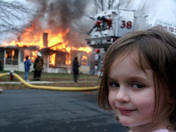
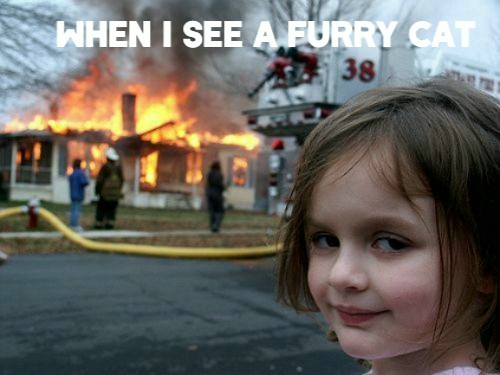
见证字幕的转变


三步添加字幕
上传你的图片
上传你想要添加字幕的图片。支持JPG、PNG、GIF和WebP格式。
创建并自定义字幕
添加你的字幕并自定义字体样式、大小、颜色和对齐方式,以获得更好的可见性和吸引力。
下载并保存
对结果满意后,以你喜欢的格式保存带字幕的图片,准备好分享或进一步编辑。
常见问题解答
表情包惯例将顶部/底部文字放在Impact字体中,高度为图片的8-12%。对于社交媒体,左对齐字幕提高移动端可读性(用户期望从左到右扫描)。对于截图,使用半透明背景框(而不仅仅是文字)以确保在任何图片内容上的可读性。
背景框对深色图片使用"变亮"混合模式,透明度70-85%(或对浅色图片使用"正片叠底")。这确保文字在复杂背景上可读,同时不完全遮盖图片。根据图片对比度调整透明度——高对比度图片需要更低的透明度。
字体大小应为单行字幕图片宽度的5-8%,正文为3-5%。对于高DPI显示器,请记住在屏幕上以24px渲染的内容在手机上可能显示为12px等效大小。在手机上查看输出以进行最终测试——大多数字幕可读性失败是因为在桌面上可读但在手机上太小的文字。
YouTube:白色Impact字体,黑色描边2px,放在底部10%位置。Twitter/X:白色字体,无描边,左对齐,6%字体大小。Instagram:白色字体,轻微阴影,8%字体大小,居中对齐。TikTok:粗体无衬线,文字效果"字幕"样式(轻微旋转,高对比度)。
浏览器渲染引擎(Gecko、WebKit、Blink)使用不同的字体微调算法。我们的预览使用你的系统渲染器;导出使用固定渲染管道。为了保证一致性,在2x分辨率下导出PNG——这减少了渲染差异的影响。字体子像素定位可能在系统之间移动文字1-2px。
对于WCAG合规性:正常文字对比度≥4.5:1,大文字(18pt+或14pt粗体+)≥3:1。避免将文字直接放在有图案的背景上——通过转换为灰度来测试可读性。对于动态图形,字幕时间应与120-150字/分钟的说话速度相匹配。
停止阅读。开始创造混乱。